Showing posts with label house tour. Show all posts

Wednesday, February 4, 2015

Before & After - the Playroom


The playroom used to be a workout room - complete with gross, stinky, moldy all-weather carpet. Here's a few pics that I snapped during our home inspection -


Sunday, October 26, 2014

The Laundry Room - Before and After

You may think that beginning my house tour posts in the laundry room is a bit strange.  But there's a method to my madness!  The laundry room was actually the first room to get a makeover - and it began the day after we moved in!  Here's what we were working with:


Tuesday, October 21, 2014

Our house - the layout

I've debated the route I'm going to take in terms of the path of my posts.  I considered doing one long post filled with the "before" pics of our house, and then smaller posts detailing each room and the projects that went into them, but in the end, I've decided to do room by room before and afters, with additional posts or tutorials where there were several projects that went into a room.  But to start, I think it would be helpful to give you an overall summary of our house and its layout.

I think the architectural style of our home is considered Southern Colonial Revival or something, owing mostly to the big white pillars out front.

Wednesday, March 2, 2011

The Basement...

Over the course of the past several months, our unfinished basement has fallen victim to my numerous projects, in addition to neglect in general, which left it looking like this right after New Year's:

Tool bench/work area


Laundry area


Utility sink area


Pantry & general storage area


Paint storage area

Furnace/water heater/more storage area


Workout/project area


Cat's bathroom - 'nuff said


Cardboard box storage area

As you can see, we have a rather large basement, but it currently has zero aesthetic value.  I'm currently in the midst of changing that, one "area" at a time.  In future posts, I'll show you how I tackle each area, on basically a ZERO budget (it's really hard to convince my husband that an unfinished basement warrants a cash investment).  In the meantime, let me share with you the basement laundry room image that has been my inspiration for my basement makeover:


Image source

Isn't it hard to believe that room is in a basement?  Better yet, check out what the room looked like BEFORE:


Image source

Looks pretty similar to what I'm starting with!  Wish me luck.....


Thursday, December 16, 2010

Heidi's Room

As a tribute to this blog's namesake, here's my official post as to the evolution of her bedroom.  This probably should have been the first post, but oh well!

So, to rewind a little, when we purchased the house, there were (and still ARE - we're not THAT ambitious) 3 bedrooms upstairs - two large ones, and one on the smaller side.  We always said that the smaller room would be perfect for a nursery (and with a little creativity, will make a perfectly adequate child's room as well - and maybe a teenager's room as well, depending upon how long we stay in the house!).  So, before Heidi was a twinkle in our eye, we had her room all picked out.  The original color was a pale blue - Robb argued that if we found out that we were having a boy, the blue color should stay, but I argued that I would still like to paint the room to really personalize it.  Luckily that argument never progressed, since we found out that we were having a GIRL!  Here's what the room looked like before:


The above pics cover 3 of the 4 corners of the room - what you don't see in these pics is the closet, which virtually takes up one full wall, with double bi-fold doors (you can sort of see one side of it in the top pic), and the bedroom door ( I took the middle pic while standing in the doorway angled to the right towards the corner) .

Our first step was choosing bedding, which would guide our color choices going forward.  I instantly fell in love with this bedding from Target:


Photo from Target site - use link above to access

I loved the bright colors, as I've never been a big fan of pastels in general, and I know that newborn babies appreciate strong colors (since they can't see well when they're first born), so I figured that this bedding would be perfect - so I added it to the baby registry. 

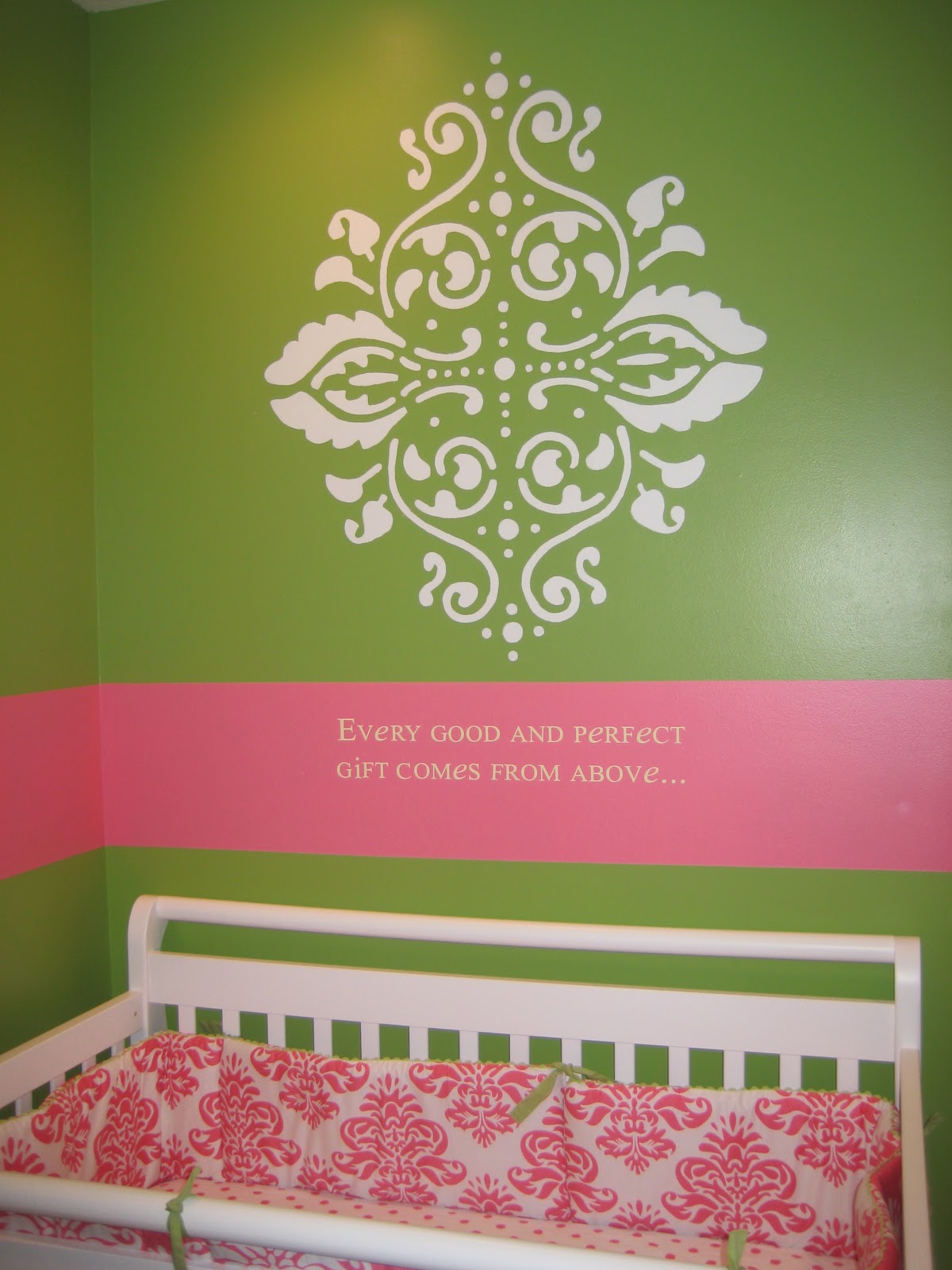
Next stop - wall color.  Robb's only request was that we not choose pink for the walls.  Hence the green color you see in the third pic above, which we matched to the green in the bedding.  The exact color is "Herbal Garden" by Behr.  It took about 3 coats to really cover the blue, but when we were finished, we were pretty pleased with the result:


I love how the green makes the moldings and floor "pop" - kind of a similar feeling that I got when we painted our old bedroom purple, which I talk about in this post.  Total cost for this change - around $20 for the paint.

Our next stop was furniture.  Since the room is pretty small, and has 2 windows which eat up wall space as well, we knew we had to limit the amount of furniture we put into the room.  Luckily, the custom closet in this room is more than adequate to accommodate clothes, toys, and then some (by "then some", I mean some of my clothes!).  So we decided upon a crib, changing table, and glider/recliner (since the room wasn't big enough to accommodate a separate ottoman to go with a standalone glider, we opted for a glider/recliner combo).  The furniture we chose was definitely not top of the line, as our intention was not to have it "grow" with her, as so many furniture places like to try to sell you on - knowing myself, I knew that I would look forward to changing up her bedroom set as she got older.  And this way, when baby #2 comes along, he/she will be able to use this baby furniture as well!  We opted for the Davinci Emily crib & changing table in white from http://www.simplybabyfurniture.com/ -


They offered (and still offer!) free shipping on all furniture, and their price was hard to beat!  The only complaint I have, which I was aware of going into the purchase, is the fact that the wood is soft, and dents easily - particularly when your child likes to use the crib rail as a teething ring!  But overall, I've been very happy with this set.  I chose the white because I really liked how the white looked with the green walls.  Total cost for the furniture - FREE (thanks to my in-laws who so generously offered to purchase the set for Heidi) - but it's currently retailing for under $400.

Once we got the changing table and crib assembled, it was time to add a little more "girly-ness" to the room.  While Robb didn't want the entire room to be pink, he did consent to letting me paint a wide horizontal pink stripe around the perimeter of the room - I'd been wanting to try painting stripes somewhere in our house, and figured that this was as good a choice as any.  I made sure to start the bottom of the stripe a couple of inches above the top of the crib, so that it wasn't hidden by the furniture, and I decided upon a width of 15" to make it strong enough to stand out in the room.  So, armed with painters tape and a laser level, I went to work measuring and taping.  That was the hardest part.  Once I got everything taped, the actual painting didn't take too long - it only took 2 coats to cover the green.  The pink I ended up choosing was "Watermelon Pink" by Behr, pulling the shade of pink from the above pictured bedding.  Here's the finished product:


Even though Robb was skeptical at first, he did agree that he liked how it turned out.  Total cost - about $10 - I only needed a quart of paint.

Next up - glider selection - here's where I derailed a bit.  I went with a friend to Baby2Teen Furniture in Manassas (if you've never been there, I highly recommend it).  In addition to a great selection of gliders, they also carry high-end furniture, strollers, car seats, accessories, bedding - you name it.  I sat down in one glider/recliner, and fell in love with it instantly. 


Photo from Best Chairs site - use link below to access

It is made by Best Chairs, from their Storytime Series.  The specific model is TRYP.  It is sooo comfortable.   I didn't choose the upholstery pictured above though - that's where this gets interesting - at least it did for me.  When I walked in to the store, I immediately fell in love with the upholstery pictured on this chair:


It's a damask pattern, and the green matches the color of Heidi's walls almost perfectly.  Problem was, this print was in no way going to successfully complement the crib bedding I had already selected (but not yet purchased or been gifted).  So, right then and there, I decided to scrap my bedding choice in favor of the chair.  I crossed my fingers that I would be able to find something that would sort of work.  Cost of the chair: not cheap - around $600.  This was our one and only splurge in the room - we figured that we would be using the chair multiple times a day, and we have been for over a year now.  We also figure that we could easily incorporate it into a family room setting when the time comes.

I didn't need to search long for suitable bedding - I was giddy when I found this bedding, also from Target, and the same brand as the previous bedding I had chosen:


Photo from Target site - use link above to access

The pink in the bedding ended up matching perfectly with the pink stripe on the wall, and the damask print matched the glider print.  I was elated.I was a little concerned that I wouldn't use the bumpers in the crib for long after Heidi arrived, based upon things I'd been hearing from my friends, so I tried to figure out a way to incorporate the damask print elsewhere in the room as opposed to just in the bumper.  I decided I would make valances for the windows out of some crib sheets from the set, but my major undertaking was to stencil a damask pattern on the wall above the crib (more about the specifics of that project in a future post).  Additionally, I found baskets from Michael's which fit perfectly under the changing table - I sewed fabric liners for them and added some grosgrain ribbon to dress them up a little.  I also obtained a (free!) white antique looking mirror from my sister's MIL, which looks great in the room.  I constructed a peg shelf and some self-made letter frames (more about that project in a later post) and hung it above the changing table, and purchased some shelves from Walmart to hang above the recliner to display stuffed animals.  A quick trip to HomeGoods for some bright pink accents (blanket and picture frames and ottoman that we use as a side table, and I considered myself ready to welcome Heidi into the world!  Here's the finished product (with the exception of the bookshelf which I just recently added - see this post ):


I hope you enjoyed watching reading the evolution as much as I enjoyed the process!  Like I said, I'll post more as to the specific projects I undertook in this room in future posts....

Sunday, December 12, 2010

A little bit of nostalgia...part 2

Continuing on from my post here, here's the upstairs tour of our lovely former DC row home.

The Stairway/Landing:

You may wonder why I'm spending any time talking about a stairway.  Well, this wasn't just any old stairway.  First off, it had a really neat feature - an up lit "museum" ledge, shown below, that served as a unique architectural element to an otherwise fairly nondescript home.  We used this ledge mainly to hold plants - we had 2 cats who were always trying to get into the plants, and this was one of the few places in the home that they couldn't get to!  The second neat feature was the fact that there was a skylight in the roof directly over the stairwell - this allowed a great deal of light to enter the home, and really made it feel a lot more like a loft living space than a row home - we used to like to describe our house as "DC row house meets NY city loft" - not that we had any experience living in a NYC loft!  Here are the pics - the hole in the wall you see to the right is actually an interior "window" into our bedroom - very cool feature:


Master Bedroom:


Here's our master bedroom.  First things first - the main reason that we chose purple as our wall color was due to the fact that our original bedding was grey/black/white/purple striped bedding from Nautica - a gift off of our registry.  However, it didn't hold up very well, and we ended up returning it to Bed Bath and Beyond (this store has the GREATEST return policy EVER!).    But, we liked the wall color, so it stayed, and we went with white/black bedding and accessories so as to not compete with the wall color.  I'm sure this was probably the first thing the new homeowner changed about the house, but that's fine with me - owning a home is all about making it YOURS, right?  As I mentioned above, I loved the interior window in our room - complete with wooden shutters which could be closed for privacy if you had company.  Since it was really only the two of us most of the time, we kept the shutters open.  The other shutters you see on the exterior windows were original to the house, and existed throughout the home - I liked the rustic feel they lent to the house, and put them back up even after we had to take them all down after having all of our windows replaced.  This room also had 2 closets in it - a rarity in DC which we loved.  I did end up eventually taking over both of the closets in this room and relegating Robb to the guest room closet, but oh well...

The Upstairs Foyer:


This area between our 2 bedrooms served as a pseudo-office for us, as you can see from the desk in the lower picture.  You can also see in the lower picture how we used to use the metal office organizer "rack", which I talk about in this post.  In the top right of the top picture, you can see a curtain just outside the master bedroom door - this curtain was hiding a floor to ceiling bookshelf, which we used for additional storage.  The doorway you see in the middle of the bottom picture leads to our one and only full bath/laundry room (as our washer/dryer was in the bathroom as well).

The Guest Bedroom:


We never really used this room to its fullest potential, I'm sad to say.  The layout was always a bit awkward, which made furniture placement tricky, and we didn't feel the need to invest in a guest bed, since we didn't have overnight guests that often, so it ended up being used as a second family room.  The wall color we chose for this room was "Corn Husk Green" by Behr.  I found the red bench at a bargain outlet for only $20!  It has a much better home here in our Virginia house.   The plaid couch you see in the pic was a hand me down from Robb's parents - it has since found a better home elsewhere in the universe that is Craigslist.  The wardrobe has also been sold via Craigslist. 

The Bathroom:


This is another room where a "before" pic would be really helpful.  It looked NOTHING like this when we moved in! I spend one Sunday ripping up the old tile floor, but then we had professionals install the new (ceramic tile made to look like white marble) floor.  I'm happy to report that I installed the medicine cabinet and vanity and sink myself - with some help from my dad.  We had the tub reglazed, and a new shower door installed, and a tile surround installed to match the floor.  The paint we chose in this room was "Gull Wing Grey" by Sherwin Williams. 

So that's it!  That concludes my 2-part installment of memories about our DC house. Stay tuned for more junk drawer makeovers with my next post!

Monday, December 6, 2010

A little bit of nostalgia....part 1

I was talking with a friend at work today, specifically about what to do to spruce up her fireplace (she has neither a mantle nor a surround currently).  I explained to her what we did in our old house, namely, adding molding around the fireplace and painting it white to tie in with the built-in bookcases that we had also painted white a couple of years before.

It got me thinking about our old house (in Capitol Hill, DC, less than a mile from the Capitol).  I spent most of the almost three years we lived there getting our living space "just right" for the way we lived in the house - and loving every minute of it.  Here's a little trip down memory lane, courtesy of my realtor, who luckily still had all of the pictures of our old house from when we sold it.  Unfortunately, I don't have any accessible "before" pics, but I will do my best to narrate what we did in each room:

The Front:


The brick was in dire need of a paint job - it was a dull beige with brown windows before, so we updated it by hiring a contractor to paint it a grey/blue (it turned out more blue than grey), hired Windows on Washington to replace all of the windows, and added a few plantings in the nice brick planter boxes which were there when we moved in.  Had we lived there longer, I think we definitely would have replaced the ugly stockade fence with something more attractive, but the (ugly) fence served its purpose, which at the time was privacy.

The Patio:


When we moved in, this area was comprised of a narrow brick walkway leading to the front (side) door, and dirt or gravel everywhere else.  The soil was too rocky and the area was too shady to serve as much of a garden, so instead we hired a contractor to put in a brick patio and retaining wall, which allowed us to add a patio set and grill to this area - this was one of the last things we did before we moved, and sadly, I feel like we didn't get to enjoy it as much as we could have - but I definitely feel like it did a lot to increase our property value.  Note: in an attempt to save money, I decided that I would try to tackle the brick patio construction on my own (with a little help from Robb).  After spending weekends for 2 months excavating the side yard in preparation to build the patio (you should have seen the size of some of the rocks I was digging up!), I eventually realized that this project was way over my head, and conceded to hire a professional.  The professionals had the patio and retaining wall built in under 3 days - I'd like to think that they did it so quickly because I did all of the heavy (digging) labor myself...:-)

We had our contractor replace the existing (teal ?!?) double door and storm door with the above large front door with sidelights to allow more light in to the house - the previous doors were old and very drafty - we definitely saved money on our heating and cooling bills by making this change!

The Entryway:


Our home on the Hill was different from most of the stereotypical Hill row homes, in that you entered it from the side, as opposed to the front.  This resulted in a layout that was more traditional - in our case the stairwell was directly in front of the entryway, the living room was on the right, the dining room was on the left, and to the far left was the kitchen.  We painted the entire downstairs (with the exception of the kitchen) the same color - "Brown Tee pee" by Behr, due to the fact that there wasn't really any division of the living/dining/entry in the way of walls.  Additionally, in the entryway, we hired a contractor to replace the (formerly terracotta) flooring with ceramic tile, which we repeated in the kitchen.  We were able to save money on the installation by purchasing and transporting the materials (tile and grout) directly from Home Depot ourselves, and we were able to cut out the middleman by hiring the company that Home Depot uses for their tile installation services without going through Home Depot.

The console table you see above on the right served as our mail table (we purchased it and a matching coffee table off of Craigslist - it was originally from Pier One.  The baskets underneath we used for shoes, hats, gloves and scarves.  The rack with hooks above the console table held our keys.  The door you see to the left was our coat closet.  Altogether I loved this entryway for both its form and function - our current house doesn't have an entryway like this, and I miss it every time I enter our house, and drop all of my bags in the living room, since that's the room you open the door into with our existing layout.

The Living Room:


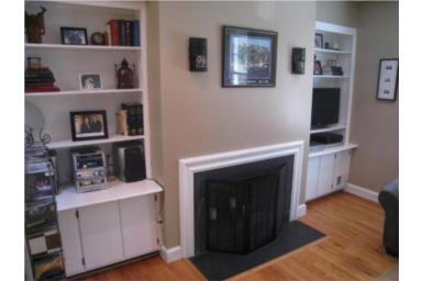
This room had great built-ins which we were immediately drawn to when we first looked at the house.  The problem was the fact that they were an ugly brown color, so the first weekend we were in the house we got to work sanding them down and painting them white (we used the same paint as was used for the trim - semi-gloss ultra white - Behr again).  The cabinets under the bookshelves were great for storing our board games and DVDs.  We also ended up painting the trim surrounding the fireplace white to match the built-ins - it was also brown previously.  A natural fiber rug and an oversized sofa and chair and a half completed this room.  We were fortunate that the house had wonderful hardwood floors throughout (other than in the bathroom, entryway and kitchen), so we didn't need to invest a lot in flooring solutions other than rugs.

The Dining Room:

This room was very square in its dimensions, so I knew that a traditional rectangular dining table wouldn't work in the space.  Instead, we opted for a square (when expanded to its full size) 60" table in the room, which allowed for seating for 8 (and served as a great game board for Mexican Train Dominoes - if you've never played before, you're missing out!)

The buffet/sideboard you see in the top picture is actually 2 identical buffets from World Market placed side by side - I couldn't find any affordable buffets that were long enough for the space, so I opted for this option, which really worked out well.  The mirror we scored for FREE from my former boss who no longer had a use for it in her home - placed over the center of the buffets, it succeeds in unifying them and camouflaging the fact that they are actually 2 separate pieces.  I found the accent table and lamp that you see in the bottom picture at TJ Maxx for under $20 each.  The rug under the dining table I found at Home Depot - unfortunately I had to special order it, since it's a square shape.

In the bottom picture, you can also see into the living room, and specifically above the sofa, the family wall that I talk about here.  You can also partially see in the bottom picture (to the left) what looks like a small doorway - that was actually where we accessed the space under the stairs, where there was a surprising amount of storage space - since we didn't have a shed, basement or garage at this house, all of our painting supplies and tools resided here - I don't know what I would have done without this convenient space - granted, it wasn't THAT convenient - I had to scrunch myself up into a ball to shimmy under the doorway into the space, and, once in, I needed to have a flashlight in hand in order to see anything!

The Kitchen:


Moving right along, this is one of the rooms that I'm most proud of, as we truly customized this room as much as possible without actually gutting it and changing the layout.  I am seriously kicking myself for not taking "before" pictures of this room. The only thing we didn't change in this room was the appliances, as they were all brand new when we moved in.  The tile floor matches the entryway tile- it was formerly the same ugly orange terracotta as was in the foyer, and we replaced it with this blue/grey/brown slate-like ceramic tile from Home Depot.  The kitchen cabinets were DARK brown, and had no hardware on them.  I spent a good month - incidentally the month after we got married - cleaning, sanding, priming, painting, and adding new hinges and hardware to these cabinets - and there are a LOT of cabinets in this kitchen by row home standards!  I decided on a cream color ("Queen Anne's Lace" by Behr) that matches the appliances - I wanted the appliances to blend in as much as possible, since they weren't terribly attractive on their own (but they were NEW when we moved in, so it didn't make sense to change them out).   The countertop was a beige Formica when we moved in - we had it replaced with a brown/blue/black granite which complemented the floors really nicely.  The sink was also replaced with an undermount sink and new faucet.  I also had the existing fluorescent under cabinet lighting replaced with much kinder xenon lighting.

The area above the cabinets allowed for decorative storage of baskets, vases, and other big items which wouldn't fit into the dining room buffets or the kitchen cabinets. The cabinet front above the sink we painted with chalkboard paint - this is where I typically planned out my meals for the week (when I was feeling hyper-organized!).

In one afternoon, I single-handedly demolished the previously existing backsplash - it was a series of orange, cream and navy blue flowered ceramic tiles which, while matching nicely with the previous brown cabinets and orange tile floor, didn't at all match the updated kitchen.  If we had lived in the house longer, one of my next projects was going to be installing a glass mosaic tile backsplash in the kitchen, but alas, we moved!

You'll notice that the kitchen doesn't have a window in it.  It was DARK, which was partly the reason that we chose this pale blue color ("Delicate Mist" by Behr) for the walls - it really succeeded in brightening and warming up the space.  Another thing that we did, upon the suggestion of our realtor, was to replace the full steel exterior door (which led out to a pitifully small back patio) with a full glass one - note, that since we WERE living in the city, the full glass door was further protected by a steel security door, but even the combination of both doors allowed for a decent amount of natural light into the room).

One (hilarious) item you can't seen in the above pictures, except for a little bit in the bottom picture, is our half bath.  That's right, we had a half bath in our kitchen - it was big enough for a pedestal sink and toilet and that was it.  In fact, my husband used to joke that you could sit on the toilet and wash your hands at the same time - and you definitely could - but I wouldn't have traded that half bath for anything - it came in handy all. the. time. I don't think we could survive with just one toilet in the house!

That concludes the bottom level tour - stay tuned for the upstairs tour tomorrow!